"Sacred Disguise" title design and animation.
A moodboard of the horror and thriller films whose sans serif titles served as our typographic inspiration.
Various fonts, weights, cases, and treatments explored in search of the perfect title design.
The decided title design. The sturdy near-monolinear letterforms give it a stoic quality, and the all-caps case treatment works with the tight tracking to create a slight unease, all while emulating the sans serif titles of older horror and thriller films.
The final title design, animated in After Effects to make it appear as though the text fades in through a layer of fog. This was done in a negative in order to accommodate the next step of printing and scanning.
The animation frames printed on paper, then scanned back into the computer to capture artifacts of the physical process.
The frames printed, scanned, and recompiled back into an animation. The printing and scanning process introduces jitter and grain which helps to emulate the imperfections of older horror movie titles.
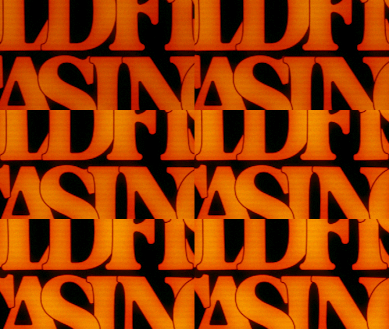
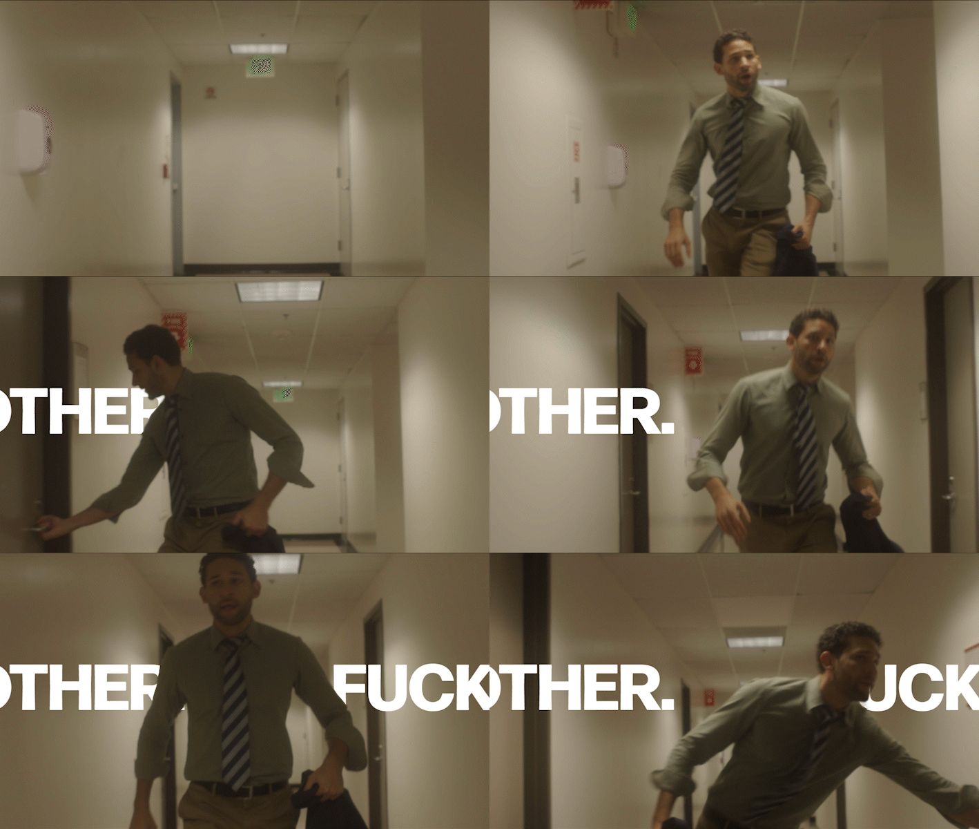
The animated title as it appears in the final cut of "Sacred Disguise."
Frame stills of the title card from the final cut of "Sacred Disguise."
